Pinnas team

> 10 years ago
Reply
Register to post, see what you've read, and subscribe to topics.
tobyhodgso
tobyhodgso
WA
300 posts
WA, 300 posts
20 May 2010 9:06am
first salvo across the bows on the logo : www.seabreeze.com.au/forums/topic.asp?TOPIC_ID=65664&SearchTerms=a

add a kangaroo to the logo- ok
running one over? sailing the board? hanging from a key chain off the clew? flying as a sail top wind flag ala 80's?
lest see what developes in my noodle....

Anita, I am many things to many people- a repressed graphic artist, and full time desk jockey - sadly not a professional windsurfer yet (and a long way off!)

(after searching for the above link i discovered i have been upselling the Wannabees logo to a few people- cheeky bugger!)
tobyhodgso
tobyhodgso
WA
300 posts
WA, 300 posts
21 May 2010 7:46am
ok. I will give you high quality logos, with your name on it, when you email me with a real email address.
Please reach a consensus on the final design, how ever you do that in Pinnas- arm wrestle, spitting contest, lightest board owner decides, wahtever.
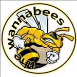
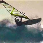
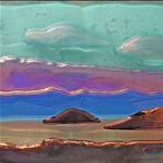
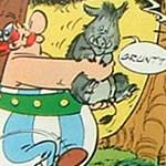
your choices of logo are:
Logo 1 (small personal name applied to sail top of leech)

logo 2

Logo 3

Logo 4


advice- when you get one as a sail logo have it printed onto white vinyl. Dont get it as a single colour with blank spaces for the white- the small linework will be tricky to apply neatly.
mineral1
mineral1
WA
4564 posts
WA, 4564 posts
21 May 2010 10:36am
Logo # 2 for me
lao shi
lao shi
WA
1346 posts
WA, 1346 posts
21 May 2010 11:06am
2 looks great. Thanks for your hard work, Toby.
If I can be picky?!
The board looks a bit small compared to the sail.
It looks a bit like Slowboat kit and none of us are that good!
Just my thoughts. Feel free to tell me to get lost
tobyhodgso
tobyhodgso
WA
300 posts
WA, 300 posts
21 May 2010 11:32am
Lao shi, thats perspective....artistic license and it looked funny larger.
slowboat board, nah...its my hypersonic with a 9m sail!!..
Windxtasy
Windxtasy
WA
4019 posts
WA, 4019 posts
21 May 2010 12:43pm
I like number 2 and number 4 (not just because it has my name on it).

If I may be picky again though, perhaps the kanga could be stylised a little more...

Did you design the Wannabees logo Toby?
Obelix
Obelix
WA
1172 posts
WA, 1172 posts
21 May 2010 2:09pm
Cheers Toby,

I'm voting for #2.

Regards,
stringer
stringer
WA
703 posts
WA, 703 posts
21 May 2010 5:33pm
i think it could be fashioned more into the shape of a pee-ness to suit the team name and mascot
Windxtasy
Windxtasy
WA
4019 posts
WA, 4019 posts
21 May 2010 6:56pm
Maybe we need a new team name... to put paid to these repetetively boring jokes.
or else not be so lazy and use our full name.
I didn't even know the full name was "Pinnaroo Point Mob" until a short time ago.

Could we be the Pinnaroos? Now that it's an international competition that would be appropriate and it would make the roo on the logo more logical...

Just have PINNAROOS on the logo rather than Team Pinnas.
mineral1
mineral1
WA
4564 posts
WA, 4564 posts
21 May 2010 7:21pm
stringer said...

i think it could be fashioned more into the shape of a pee-ness to suit the team name and mascot


Ay stringer, kitmykangaroosta[}:)]
Obelix
Obelix
WA
1172 posts
WA, 1172 posts
21 May 2010 8:58pm
Windxtasy said...

Maybe we need a new team name... to put paid to these repetetively boring jokes.
or else not be so lazy and use our full name.
I didn't even know the full name was "Pinnaroo Point Mob" until a short time ago.

Could we be the Pinnaroos? Now that it's an international competition that would be appropriate and it would make the roo on the logo more logical...

Just have PINNAROOS on the logo rather than Team Pinnas.


To be honest, until the recently, I haven't even realised...
Even my wife told me she would only call me a Pinnas when I annoy her.

I just realised Pinnaroos also has a "roos" so the logo's kangaroo would be more fitting. Not unlike the bees in Wannabees.

I'll side with Windxtasy here. I'm curious what everyone else is thinking?

hardpole
hardpole
WA
609 posts
WA, 609 posts
21 May 2010 11:10pm
I will own up an even though I have sailed at Pinnaroo point a lot over the years I still always think of the "other" Pinnaroo when its mentioned

http://www.mcb.wa.gov.au/OurCemeteries/Pinnaroo.html

But I dont mind changing the name to the full one, and the cemetery is well known for its Kangaroos.

And heres a tombstone
pweedas
pweedas
WA
4642 posts
WA, 4642 posts
21 May 2010 11:40pm
Windxtasy said...

Maybe we need a new team name... to put paid to these repetetively boring jokes.
or else not be so lazy and use our full name.
I didn't even know the full name was "Pinnaroo Point Mob" until a short time ago.

Could we be the Pinnaroos? Now that it's an international competition that would be appropriate and it would make the roo on the logo more logical...

Just have PINNAROOS on the logo rather than Team Pinnas.


From someone totally unconnected to it, (although I did drive past there once) I agree with Windxstacy.
I think that the the first image is the best for a T-shirt logo if you replace the 'Team Pinnas" with "Pinnaroos" and then if someone wants their name on it, put it inside the north west quadrant of the circle.

The larger size of the kangaroo is then more relevant to the name Pinnaroos.
I might also take the dot off it's nose. It doesn't quite look right.
Windxtasy
Windxtasy
WA
4019 posts
WA, 4019 posts
26 May 2010 10:12am
Looking at these logos again, I think I now prefer number one, to go with the name PINNAROOS - but I would like the kangaroo simplified a little and his face made a little more roo like, and his ear flying back in a more speedy manner.
I have done a little mock up in paint (don't know how to use those fancy graphics programs or else I'd be applying for that job with Severne!) you can do it better Toby, I'm sure.

PINNAROOS at the bottom to replace "team Pinnas". (Don't know how to do that either)


nebbian
nebbian
WA
6277 posts
WA, 6277 posts
26 May 2010 10:43am
One thing is that it has to be legible at avatar sizes.

Here's the logo above, scaled down to 100 px high:


Hmmm... it's better than I thought it would be

I have trouble telling the Wannabees apart just from their avatar though.
Windxtasy
Windxtasy
WA
4019 posts
WA, 4019 posts
26 May 2010 10:55am
just to confuse things more...

Whilst Toby's logo is very stylish it makes us look more like a wavejumping team than a speed sailing team.

Perhaps something more like this:
(again only a quick mockup to give the idea)
Actually I'd like a cool sunglass wearing 'roo with arms outstretched as if holding onto the boom and sailing the board - can do that artwork if you like the idea


mineral1
mineral1
WA
4564 posts
WA, 4564 posts
26 May 2010 10:57am
nebbian said...

One thing is that it has to be legible at avatar sizes.

Here's the logo above, scaled down to 100 px high:


Hmmm... it's better than I thought it would be

I have trouble telling the Wannabees apart just from their avatar though.


Just for the avatar, try changing the colours and see what it looks like. Maybe the colours will stand out a bit more,if change only for the avatars like
(I would do this myself but um dunnohow)
Windxtasy
Windxtasy
WA
4019 posts
WA, 4019 posts
26 May 2010 10:57am
nebbian said...

One thing is that it has to be legible at avatar sizes.

Here's the logo above, scaled down to 100 px high:


Hmmm... it's better than I thought it would be

I have trouble telling the Wannabees apart just from their avatar though.


It depends what our logo is for.
Are we going to use it for an avatar? I wasn't intending to.
Is it for sail stickers? or T shirts?
Either way I agree it has to be simple, but maybe not as simple as an avatar would require.
Windxtasy
Windxtasy
WA
4019 posts
WA, 4019 posts
26 May 2010 11:21am
another thought:

perhaps we should decide on team name FIRST

as that will determine the prominence of the kangaroo on the logo.
tobyhodgso
tobyhodgso
WA
300 posts
WA, 300 posts
26 May 2010 12:43pm
I vote Pinnaroos!
(fox in the henhouse....)
Obelix
Obelix
WA
1172 posts
WA, 1172 posts
26 May 2010 1:04pm
I like Toby's idea to put our nickname on the sail.

Or, if Toby gets annoyed with us, we could ask Severne's "Graphics Designers" to help. "Pinnaroos are good"
hardpole
hardpole
WA
609 posts
WA, 609 posts
26 May 2010 3:04pm
I suspect getting individualised sail stickers would cost more than a run of all the same one. I already have the Pinnas stickers that Chad organised on two of my speed sails and probably wouldnt' put another one on those. As most of my sails are second hand they already have other peoples sail numbers and stickers anyway. That mass of black tape on my 5.8 is not holding it together, its covering Troppos number up ;-) and when using my 6.5 I just pretend to be Marcel !

I hope I dont sound like a cheapskate but if we are spending money I would probably rather it (or at least some of it) went towards the GPSTC costs. My 2c worth.

Logos for on screen (avatar etc...) can be multi coloured etc... while for a sail you want one colour to keep down cost (I suppose). I do prefer the "speedy" logo from Winxtasy (sorry Toby), and the text is clearer.

Team name:

Im not that fussed but if we dont want to sound like "you know what" PinnaRoos would be less confusing (what about just "Roos" ?) I think most of us have sailed at Pinnaroo "recently" but its not like its our main spot. But given that on sunday 6 people sailed in 5 spots we dont really have a single location.


lao shi
lao shi
WA
1346 posts
WA, 1346 posts
26 May 2010 4:04pm
Windxtasy said...

just to confuse things more...

Whilst Toby's logo is very stylish it makes us look more like a wavejumping team than a speed sailing team.

Perhaps something more like this:
(again only a quick mockup to give the idea)
Actually I'd like a cool sunglass wearing 'roo with arms outstretched as if holding onto the boom and sailing the board - can do that artwork if you like the idea


Like this one. Does it need the circle?
Keep the ideas coming folks. Good discussion.
Tell us what you would like for team stuff.
Badge / car sticker / t-shirt, bearing in mind GPSTC fundraising too.
I vote for a team flag to be flown in the car park when sailing!
Pointman
Pointman
WA
437 posts
WA, 437 posts
26 May 2010 4:09pm
Windxtasy said...

just to confuse things more...

Whilst Toby's logo is very stylish it makes us look more like a wavejumping team than a speed sailing team.

Perhaps something more like this:
(again only a quick mockup to give the idea)
Actually I'd like a cool sunglass wearing 'roo with arms outstretched as if holding onto the boom and sailing the board - can do that artwork if you like the idea


I like this version and I'm happy with a team name change...the infantile jokes about male appendages are getting tired.

Edit: only thing missing is a fin!

lao shi
lao shi
WA
1346 posts
WA, 1346 posts
26 May 2010 4:33pm


Windxtasy
Windxtasy
WA
4019 posts
WA, 4019 posts
26 May 2010 5:40pm
Pointman said...

Windxtasy said...

just to confuse things more...

Whilst Toby's logo is very stylish it makes us look more like a wavejumping team than a speed sailing team.

Perhaps something more like this:
(again only a quick mockup to give the idea)
Actually I'd like a cool sunglass wearing 'roo with arms outstretched as if holding onto the boom and sailing the board - can do that artwork if you like the idea


I like this version and I'm happy with a team name change...the infantile jokes about male appendages are getting tired.

Edit: only thing missing is a fin!


Glad you like it.
The fin is under the water of course.
The circle makes it look sharper and more logo-like I think, and would facilitate making it into a sticker.
Looks like I might have to get out my pen and paper and add the windsurfing roo.
(Much easier the old fashioned way)
saltiest1
saltiest1
NSW
2568 posts
NSW, 2568 posts
26 May 2010 10:06pm
"last" is not spelt "pinaroo". spell check it.


saltiest1
saltiest1
NSW
2568 posts
NSW, 2568 posts
26 May 2010 10:08pm
for the record, i like the 1st one.
Pinnaroos47
Pinnaroos47
3 posts
3 posts
1 Jun 2010 11:18pm
3 suggestions;
1) curtail the stripes coming off the stars before hitting the next star or its contrail - looks a little bit too crowded to me
2. Perhaps "Pinnaroos" rather than "PINNAROOS" - that way the capital P can tuck nicely under the nose of the board and give the team name a more synchronised look immediately adjacent to the board.
3. Perhaps a slightly thicker font for the text.

Otherwise it looks great - well done.

Birdman
westozwind
westozwind
WA
1418 posts
WA, 1418 posts
1 Jun 2010 11:52pm
So Lao_shi is gonna have to peel this one off

Please Register, or first...
Topics Subscribe Reply

Return To Classic site 😭
Or... let us know if a problem, so we can tweak! 😅