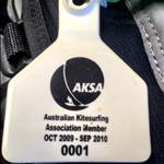
LostinSpace said...
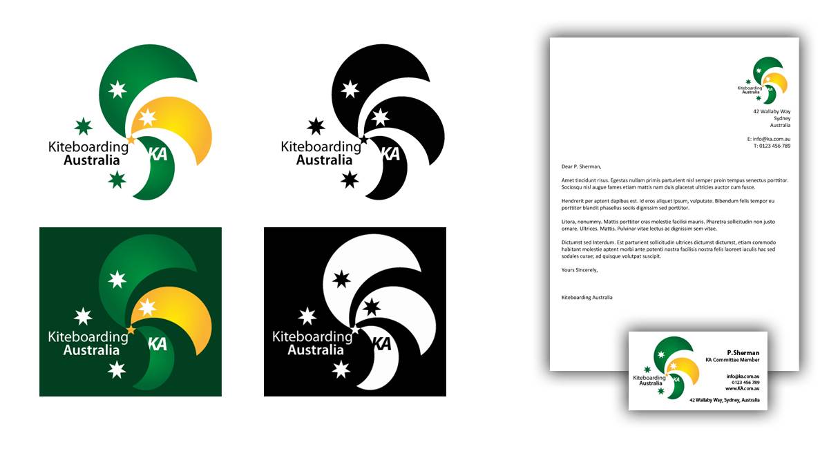
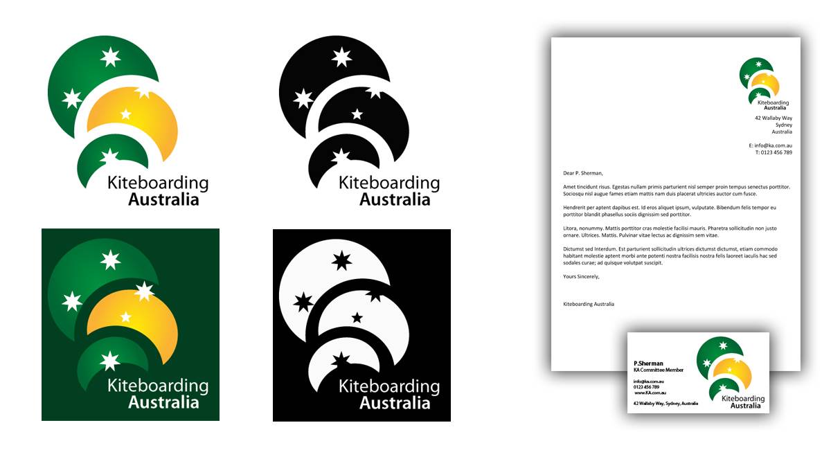
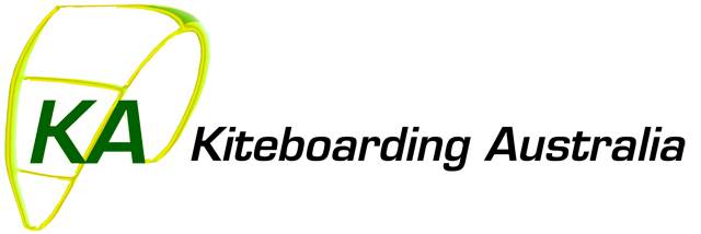
....... the entry by Windy Wocket with the Green & Gold and unmistakable dominating more true Kite shape representation logo proporting the Southern Cross looks and feels something I would more identify with that it has some importance and feel about it that it represents a National Australian Organisation involved in Kiteboarding. Out of all other logo submissions this is the one that I feel even comes close to representing an image of our sport that is undeniable an Australian sport in it's image .......
......if there is no other alternatives then I only hope that KA has some forsight and wisdom to see that Windy Wockets submission is the better of the two current top submissions. (my emphasis here)
I feel I am saying this with some level of ability as I have been involved with design for over 30 years. Please accept I have no affiliations with either the two designers, just that I feel strongly enough that it's something KA should get right for the betterment of our sport.
ditto & bravo LostinSpace
I too am not about canning anyone personally but having a background in marketing as well I thought there had to be some grounded 'advice' to potential voters.
It is extremely important to the image of any organisation that it presents impressively; with a clear message of professionalism which has congruent impact. The logo is a lynch pin of that image so it must be simple, eye-catching and immediately identifiable as a representation of all that the organisation stands for.
I agree wholeheartedly with LostinSpace. The 99Designs formula for logo selection has failed in this instance. I too would hope that the current KA reps can look beyond the polling figures before selecting a logo.
IMO the brief to graphic designers for a National Kiteboarding Org. should include the need to represent these sort of things:
- its Australian
- its Kiteboarding
- its a highly active high sport
- its an adrenalyn sport (not extreme but still seen to be by the public)
- it has an 'entity' representing the sport which is active & professional
- the sports appeal is based on individual pursuit - rather than team type sports
- the sport is 'free-spirited' wind, waves, natural power, out-doorsy, aquatic etc.
These are the sort of ideas that would be thrown around in marketing meetings where a team - including the artists - would develop the concepts of an organisational image from which the logo would evolve.
As LostinSpace says the '99 Designs" formula has not produced logos which address these core issues with any impact or attractive appeal.
I agree "Windy Wockets" southern cross kite does the best job
by far of whats on offer.
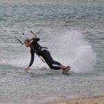
BUT the concept of looping kites making up an image - recognisably kiting, portrays the action element extremely well (esp to kiters) etc etc is a
fantastic concept by luluvic. It could be worked up to something really special. But definitely needs the working up before it could be acceptable.