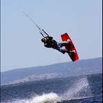
Also I really think bright boards are underated, they are much easier to spot especially in bad light situations. Personally I don't give a fig how the board looks, just how it rides. Some of the board graphics that companys produce(such as grey/blue colours) would be much hardrer to spot than say a bright orange/green/red board. But I guess how they look is more important as they are the designs that sell.
That's right! Make sure that you have a board with Bright Colours and avoid boards with lots of blue and white!
I have a 2006 Jamie Pro and it's white on one side and blue on the other. It's extremely difficult to spot from a distance in blue water with a lot of white caps (i.e. always) . Very stupid choice of design colours.
Thank God it has black foot straps and red fins, just enough colour to give you a hint.
Last week I almost lost it (again) after one of the bridle lines snapped about 400m from the shore in Adelaide. Obviously body dragging wasn't an option.
Fortunately I got a binocular for Christmas (First I though it was a stupid present) that was very handy to locate the board, but it still took me an hour to get it back.