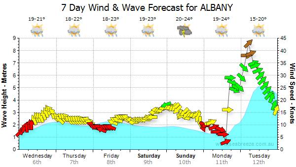
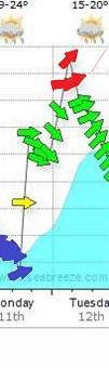
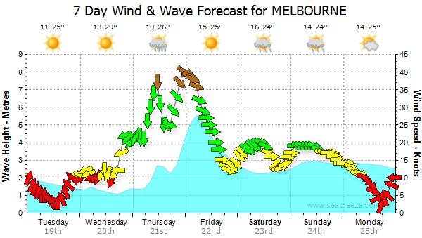
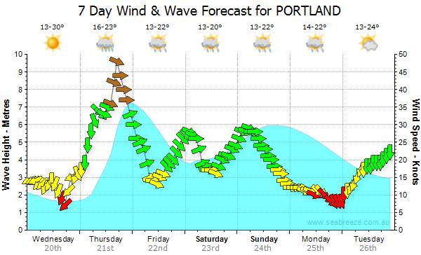
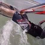
The new format is SO SO, im finding the arrows to be to fat and somewhat less accurate to look at .But the scale change is good and the brown arrows over 35 knots is a good introduction/ With out overdoing it. BUT,there may be scope for a forth colour

for say glass offs / light and variable .
I also find the gaps between arrows on the days real time wind display to be very open making it look less accurate and linked , Nothing better than seeing solid green and a refined accurate graph, illestrating variations in wind strenght / direction from your days action on the water

Funny how when you really look on the original wind graphs,the arrows have variations in width of them. Does this mean any thing
Version 4 Laruie Try making the arrows twice as tight as the original and linked like a snake /dragon tail.
Im sure ill cope either way