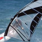
Ah right, you've taken the windsurfer from the photo. That's actually quite good.
How long you been doing this? You might be a natural.
The second one is much improved. The only suggestion I'd make is to have the drop shadow a little more subtle, you want a grey (or even juuust indigo) for realism. Add a black, very thin outline around the text to make it stand out. I liked the first cartoon windsurfer better. That's all. Very good.
Maybe, move your harness lines closer together?