Wacked out Colour Schemes of the last few years.
So it's that time of year again when I'm looking at new gear that I really don't need, with my girlfriend hiding my credit card from me as a preventative measure.
So many claims from kite manufacturers about how their kite is x times more poppy than last year, x times more stable, and easier to relaunch. It seems nobody pays attention to their brand being x times more garishly colourful. It's a trait I want to see improved upon until all we see are fluorescent green and purple works of art.
What are your favourite or most hated colour schemes in the last few years?
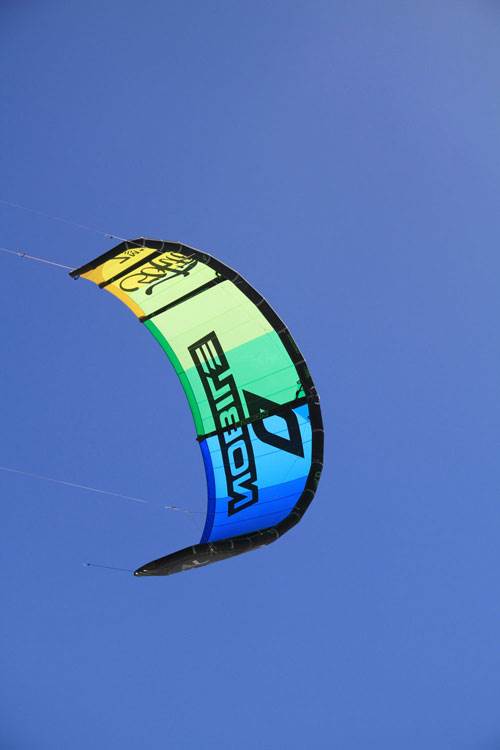
My favourite would have to be the Nobile 50Fifty:

In my opinion, one of the worst colour schemes belongs to the Best Yarga: